My Artwork
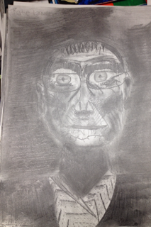
Title- Old Man
Course- Design
Teacher- Mrs. Powers
Subject Matter- An old man in black and white
Medium- Drawing pencils
Project Goal- The project goal for this project was to recreate a picture of an old man that we were given using drawing pencils. With this project, you were given a picture and trying our very best, using elements of design to recreate it to the best of our abilities. You had to draw everything in the picture which was the man with his shirt and glasses.
In this project I mainly used 4 elements of design. The first element I used was value. I think this was the most important element of all in this project. Since there was not a wide color variety, you really needed to use value to show what was going on. The second element I used was color. Using my different shades of drawing pencils, I could create blacks, greys, and whites. The color was part of value. The third element I used was line. I used line throughout the entire picture. I had strong lines in the mans shirt and face. The fourth and final element I used was shape. I used shape in the mans shirt, glasses and eyes.
This project was more like an assignment to see where you were in the knowledge of design. We haven't learned anything this year, so we just tried our best. This was actually fairly hard to do. I couldn't get the shape of the mans face at first and just drawing a human was very hard. He had lots and lots of wrinkles and you had to add a ton of value to make him look somewhat realistic. It was also a great learning experience. I really got to see where I was as an artist and it was actually fairly fun in the process.
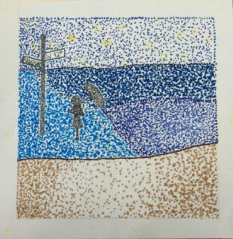
Title- Girl in The Sea
Course- Design
Teacher- Mrs. Powers
Subject Matter- Girl with an umbrella
Medium- Pointallism using markers
Project Goal- The project goal for this project was to show value using pointallism. With this project, you needed to choose an object and place it in an interesting background. Either the background or the main focus in the picture needs to be in black and white while everything else is in color. In this picture, I have a girl with an umbrella in black and white. The beach, sky, and New York street sign is in color.
In this project I mainly used 3 elements of design. The first one was value. I didn't do my best while using this element, but I tried to use it by showing the different colors in the water as if there was a sun shining on it from the left. I wanted it to look somewhat realistic but not too much. The second element I used was color. I used this element in my project by using different colored markers in my project. I wanted the colors to blend together well and make it clear what I was trying to create. Lastly, I used was space. I used space by giving distance between the girl and the street sign. I wanted to show that the girl was thinking about what she was looking at and she wasn't to eager to go somewhere.
I really liked the idea of this project. I thought it was a cool idea and I thought I could have some fun with it. I could of had a better idea to draw, but I did what I did. Part of my time issue was I left it on the airplane on my way to Florida, so I was a little short on time. I could of added more value . I did like my color choices though. I think they went good with each other. I think it was a cool project. It was a cool project because you could really do anything and there was a lot of freedom with your imagination.

Title- New Jersey Boardwalk
Course- Design
Teacher- Mrs. Powers
Subject Matter- The stores and scenery of a boardwalk
Medium- Watercolor and black sharpie
Project Goal- The project goal for this project was to show one or two- point perspective correctly using water color. You needed to have two reference pictures and a full page sketch before you could begin .With this project, you needed to choose a picture and accurately recreate it with water color and sharpie. I chose to draw a boardwalk from Wildwood, NJ.
In this picture, I mainly used 5 elements of design. The first one was line which I used well by using my sharpie. I did this to really add depth to the picture. I wanted it to be nice and crisp. The second element was value which I didn't use too well. I could of added a lot more value to make the piece of art better. I wanted to add lots of value to make it look like the sun was shining from the right. I wanted it to look a The same goes for texture. I could of added a lot more texture through out my entire picture. I wanted to add texture in the sand and wood in the boardwalk to make it look realistic. I also used color well by using the different water colors and sharpie marker. Lastly, I used shape in the buildings to correctly re-create the picture.
I think this project was very cool. I think this project turned out very cool looking with the marker outline. I think this turned out very crisp looking and I enjoyed making this very much. It was cool

Title- Blingy Boogie Woogie
Course- Design
Teacher- Mrs. Powers
Subject Matter- Recreation of the Broadway Boogie on flip- flops
Medium- Acrylic paint, sharpie, multiple colored rhinestones of different sizes, and E6000 glue
Project Goal- The project goal for this project was to re-create a painting by a famous artist. You could use any medium on any object you choose. Before you could begin though, you needed to know exactly what you were going to use. You also needed a colored picture and a full page rough draft.
In this picture, I used 4 elements of design. The first one was texture which I created well by using rhinestones. The second element was line which I used well by using my sharpie. I really wanted the lines to be very definite.The third element was shape which I created well by drawing and filling in squares and rectangles. My fourth and final element was color which is clearly shown by my use of paint, sharpie, and colored rhinestones. I wanted this project to be very simple but still have some flare.
I was a big fan of this project. It may of been one of my favorites. I really liked how we could have a lot of freedom with it and we could do whatever with it. I maybe could of filled it the squares a little better with the rhinestones, but I think it looks good as is. This project was a fun one to do.

Title- The bowl of a flower
Course- Design
Teacher- Mrs. Powers
Subject Matter- A red petaled flower
Medium- Clay, hot glue, and tempura paint
Project Goal- The project goal for this project was to create pretty much anything correctly out of clay. You had free range of what to do and you just had to make it using proper technique. All you need to have to begin was a full page sketch.
In this project, I used only 2 elements of design. The first element of design I used was shape. I used shape to create the base and flower petals to make it clear that I was creating a flower. The second element of design I used was color. I used bright red and yellow color in my flower to make to bright and remind me of spring and summer time.
This was a very fun project to do. I likes how we had a lot of freedom of what to create. I could of constructed my project better at the start. Since I had to form my project in a bowl, I couldn't connect the whole project together in the back, so everything fell apart. But, it turned out okay because I just hot glued it all together and now it looks fine. I just like how it turned out and I'm very proud of it. It was a great piece of art that I could add to my room.

Title-Lined heart
Course- Design
Teacher- Mrs. Powers
Subject Matter- A heart with lines through it and a swirl.
Medium- A hand carved printing block, colored printing ink, and sheets of colored paper
Project Goal- The project goal for this project was to create a picture or design using printing methods. All you need to start was a sketch. You could do anything as your picture or design.
In this project, I used 3 elements of design. The first element was line which I used inside the heart. I wanted a pattern inside of the heart and I thought the lines would add to it in a good way. The second element was shape which I used by carving out a heart and a swirl. I was just going to do a heart by I thought it needed something more, so I added a swirl. I also used the element of design called color. I purposely used the colors of ink and paper that I did so it would look like a theme.
This project was something new for me. I have never done print making and carving, so it was really cool to do something different. I could of carved the lines more evenly but other then that, I though the project turned out pretty good. This was a cool project and learning experience. It took me a couple of trys to get it right, but practice makes perfect and it looks very nice and crisp.

Title- The octopus
Course- Design
Teacher- Mrs. Powers
Subject Matter- A pink and purple octopus
Medium- Mask base, molding magic, paint, wire, felt, glue, glitter, wood
Project Goal- The project goal for this project was to recreate a face onto a mask. All you needed to have to start was a full page sketch and a list of supplies you would need to create this project. You could do anybody or anything.
In this project, I used 2 elements of design. The first element was texture which I used through the entire mask. I used this element because I wanted to make this mask look as realistic as possible. The second element I used was color which I also used throughout the entire mask. I used this element a lot because I wanted this project to really pop and be appealing to the eye.
This project was a very fun project to do. You could really show your creativity and could do whatever you wanted to. This project took me a reasonable amount of time and I really am proud about how it turned out. At first, the molding magic cracked all over the base of the mask. this is what led to the lines of glitter all over the face. I made the lines to cover up the cracks and I think the glitter adds a lot to the mask.The tentacles also took me some time to make, but they turned out just fine in the end.

Title- Flip Flop Love
Course- Design
Teacher- Mrs. Powers
Subject Matter- A purple, black and white tribal printed flip flop color shape line value
Medium- Drawing pencils, colored markers, oil pastel and sharpie
Project Goal- The project goal for this project was to draw anything of you choice using 4 different mediums. To start, you needed to have a full page sketch and have it approved. You also needed to know what mediums you were going to use and you were sure that you had access to the mediums. After you did all of this, you were ready to go.
In this project, I used 4 elements of design. The first element I used was color. I used color with all 4 mediums. I chose to mainly use the color purple because I think it is a very summery and happy color and that's what the ides of this project is for me. The second element I used was shape. I used shape in the pattern in the flip flop. I wanted to add something to the flip flop, so I added lots of pattern. The third element I used was line. I used line throughout the entire piece of art. I used it mainly in the flip flops pattern. I wanted to lines to be very definite. The fourth and final element I used in this project was value. I used value in the flip flop To make the piece of art seem more realistic.
This was our final project of the year. For me, it went by very fast, both the year and the project. The project was nice and simple and was fairly easy. At first I couldn't get the measurements right and it got a little frustrating, but they turned out perfectly in the end. I just did a llttle problem solving and it turned out fin in the end. I really enjoyed this project.
